In today’s visually noisy digital world, your thumbnail often carries the enormous responsibility of making the very first impression. Whether it’s a game in a crowded casino lobby, a video on a streaming platform, or an app icon in a store, thumbnails have seconds—sometimes fractions of a second—to grab attention and communicate value. But how do you know if your thumbnail identity is genuinely strong enough to stand out?

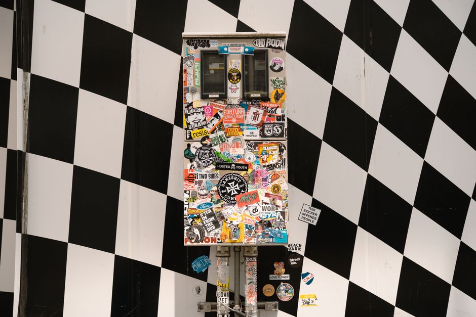
From my eight years of experience analyzing online visual identities and small-image interfaces, I can tell you it’s less about packing in details and more about clear, memorable cues that read well at phone size. In this article, we’ll explore the fundamentals behind a powerful thumbnail identity and share best practices informed by accessibility standards like the GOV.UK Design System. We’ll also tackle some common pitfalls like thumbnails that use tiny text or confusing imagery that does more harm than good.
Thumbnails as First Impressions: Why They Matter
Thumbnails often serve as your product’s visual handshake. Especially in crowded environments—think: bustling game libraries or app stores—your small image needs to:
- Grab user attention instantly Convey your brand or product identity clearly Encourage users to click or engage further
But thumbnails do all this in a space roughly 100x100 pixels or smaller in many UI contexts. At this size, every pixel counts. Overloading the thumbnail with detail or text turns it into clutter. The user’s brain can’t parse complicated images quickly at these scales, so the design must prioritize recognition over detail.
Designing for Crowded Game Libraries and Digital Lobbies
From mobile casino apps to mainstream game stores, product lobbies quickly become overwhelming rows of small thumbnails. Users scan these grids rapidly looking to spot a title or brand they know—or something distinct enough to warrant a second glance.
Here’s the crucial insight I’ve learned from repeatedly screenshotting and comparing lobbies side-by-side: One strong subject or visual cue outperforms busy artwork every time. When your image competes with many others, complexity dilutes memorability. A single, well-chosen symbol or character pose that anchors the thumbnail creates a stronger mental imprint.
Focus on Single Focal Point and Visual Hierarchy
Ask yourself:
- Is there a dominant visual element that catches the eye first? Avoid multiple competing subjects or noisy backgrounds. Is the composition guiding the viewer’s gaze? Use size, contrast, and placement to build a clear visual hierarchy. Does the thumbnail become instantly recognizable at thumb-size? Zoom out regularly during design to check how it holds up on small screens.
For example, generic character poses are a common mistake. So many thumbnails feature basically the same “hero with weapon” silhouette. Instead, focus on a distinctive gesture, a unique color block, or a memorable symbol that sets your identity apart.
Contrast and Accessibility on Small Screens: Learning from GOV.UK Design System
Thumbnails must function across diverse devices and viewing conditions. Accessibility isn’t just about compliance; it’s about strengthening your image’s effectiveness. One of the best references for ensuring legibility and contrast at small scale is the GOV.UK Design System’s colour guidance. Their recommendations are designed to maximize readability and distinctiveness for all users.
Key Takeaways from GOV.UK Contrast & Accessibility Guidance
- Ensure sufficient contrast: Use colour combinations that pass at least AA standards (4.5:1 contrast ratio) to keep foreground elements visible against backgrounds. Avoid placing tiny text or intricate patterns on complex backgrounds: The complexity obstructs readability and recognition. Test your thumbnail in grayscale and under different lighting conditions: This helps catch issues where colour contrast might be insufficient. Consider color blindness: Don’t rely solely on hue differences—use shape, size, or outline to convey key information.
In thumbnails, this usually means:
- Choosing solid background fills rather than gradients or photorealistic textures Placing iconography, logos, or key subjects in high-contrast zones Keeping text minimal and bold or avoiding it entirely in thumbnail images
Memorability: Prioritize Distinctive Cues Over Excessive Detail
Memorability in thumbnails boils down to distinctiveness. Human brains remember simple, bold, and unique shapes far better than cluttered scenes.
Why? Because at thumbnail size, details simply vanish or turn into noise.
Here are some design principles that boost memorability:
Use strong silhouettes or shapes: Shapes like a fist holding cards, a recognizable mascot pose, or a unique outline make quick impact. Employ a limited color palette with contrast: Too many colors reduce focus. Bold primary or complementary colors create visual “shocks” that stick. Incorporate brand cues: Logos or unique icon elements can enhance recognition when integrated subtly but clearly. Test variations by displaying thumbnails next to competitors’: This side-by-side approach helps you spot when yours gets lost or stands out.Common Mistakes to Avoid
- Tiny or unreadable text: Words in thumbnails rarely survive scaling and hurt legibility. If price or offer info is essential, place it in expanded views, not thumbnails. Dark lettering on detailed or dark backgrounds: Bad contrast confuses the eye. Follow GOV.UK’s contrast ratios to avoid this. Using generic character poses that look identical to many other thumbnails: Leads to confusion and reduces clickthrough. Crafting artwork that promises a live host or interactive feature when there isn’t one: This sets wrong expectations and leads to user frustration.
Bonus Tip: Why You Don’t Need Prices in Your Thumbnail
A surprising, often overlooked mistake I see in scraped content thumbnails is trying to cram pricing into the tiny space. Prices online casino lobby UI may change quickly and are seldom the primary thumbnail hook. Instead, they clutter the image and compete with your identity cues.
A better approach: Use thumbnails to build interest and trust through strong identity and leave price details for the product page or expanded views where there is room for legibility and context.
Quick Thumbnail Strength Checklist
Criteria Is Your Thumbnail Passing This? Notes Is there a single focal point or dominant visual? Yes / No Avoid clutter or multiple competing subjects Does it remain recognizable when scaled down to ~100x100 px? Yes / No Zoom out often when designing Are foreground and background colors contrasting enough? (Check with tools or GOV.UK standards) Yes / No Use 4.5:1 contrast ratio minimum Is text avoided or kept extremely minimal and bold? Yes / No Tiny text is usually unreadable Does it include distinctive, memorable shapes or brand cues? Yes / No Make sure it feels unique compared to competitors Is pricing or other transient info excluded? Yes / No Keep pricing off thumbnails to avoid clutterFinal Thoughts
Your thumbnail identity’s strength hinges on clarity, contrast, and memorability. When you prioritize a single strong subject, follow proven accessibility contrast guidelines like GOV.UK’s, and test your image at actual thumbnail sizes, you create a visual asset that stands out powerfully in crowded digital spaces.
Remember: Recognition beats detail every time. Focus on creating an unmistakable first impression rather than cramming in everything at once. This approach not only boosts clicks and engagement but also cultivates lasting brand recall — the foundation of any successful visual identity.
So next time you design or evaluate a thumbnail, ask yourself: Will this still read clearly and grab attention at phone size? If the answer is yes — congratulations, you might just have a strong enough thumbnail identity.